By Leap Design Team · 8 min read · — May 2026
90%+ of Shopee and Lazada traffic is mobile. Most listing images are still designed on a 27-inch monitor. A field guide to what breaks—and how to stop it.
The Gap
There's a gap between the listing your designer made and the listing your customer actually sees. On a 27-inch iMac it's invincible. On a 6.1-inch screen, it's catastrophic.
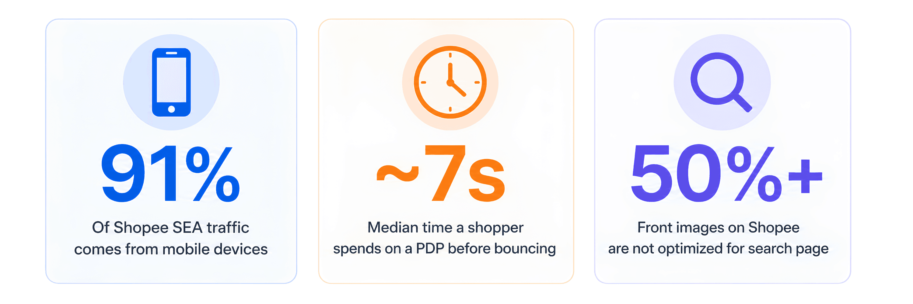
We see this every week at Leap. A brand sends us their PDP for review. The Figma file is pristine—generous whitespace, considered typography, four neat columns of feature copy. Then we open Shopee on a phone, the same phone 91% of their customers will use, and we can barely read the headline. Trust badges are smudges. The before-and-after is unintelligible. The carousel has eight slides and the last five will be seen by 4% of shoppers.
This isn't a small problem. It's the difference between a listing that converts and one that doesn't.
"Stop designing listings to survive a Figma review. Start designing them to survive a thumb scrolling at 4cm a second."
01 — The Break List: What Actually Fails on Mobile
Below: four side-by-side comparisons of patterns we audit out of client decks every single week. Each pair shows the same image—first as the designer presented it, then at the exact size it appears on a Shopee or Lazada feed. Same pixels, different reality.
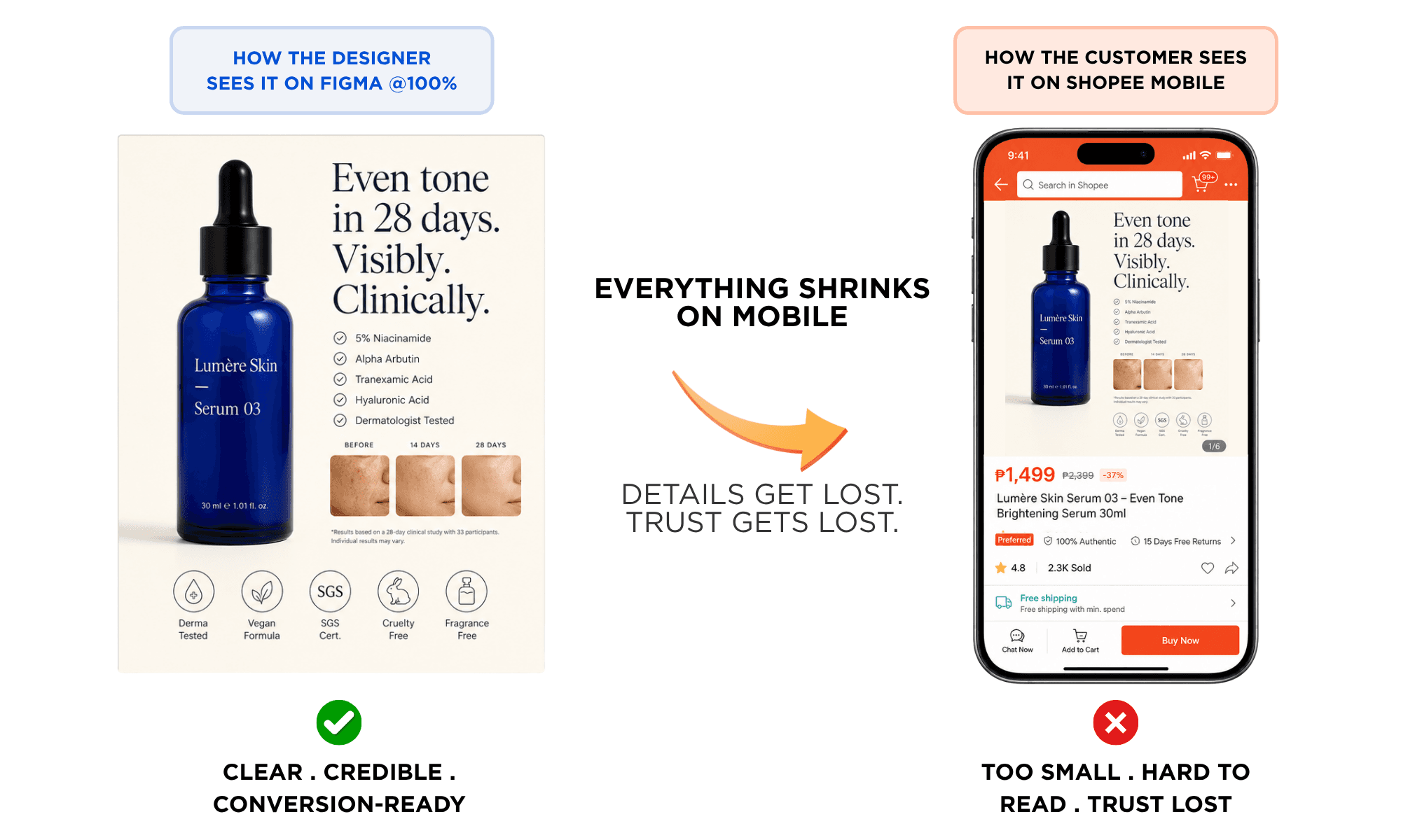
Break #1 — The Tiny Text Trap
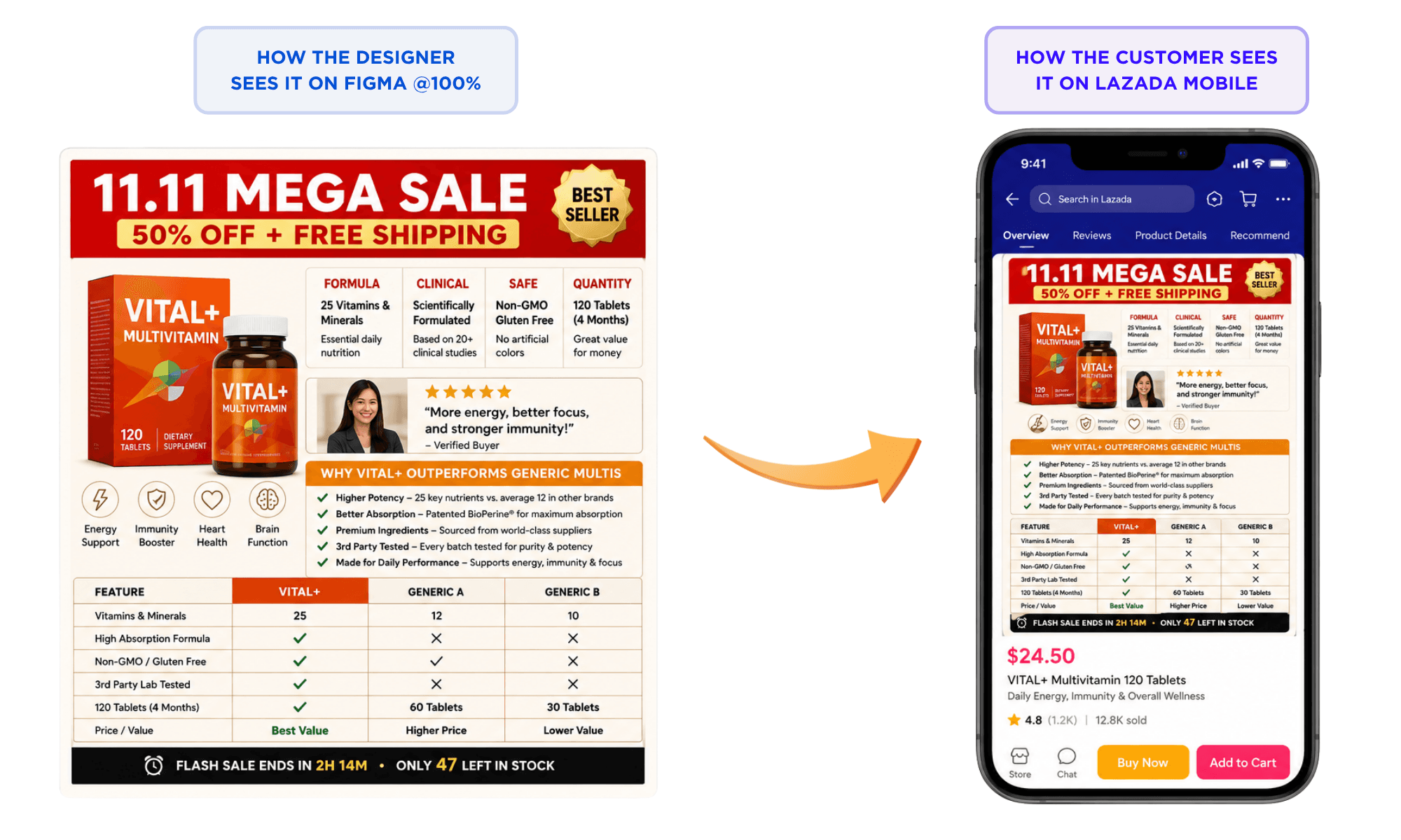
Break #2 — The Information Dump
As you can see, the Trust Signals just disappears! Verdict: four tiny circles in a row read as "decorative pattern." Trust isn't conveyed—it's just visual texture.
The fix: Pick the one or two certs that actually matter for your category and make them big. Better still, give certifications their own dedicated slide where they can actually be read. A single legible "USDA Organic" badge beats eight illegible ones every time.
Verdict: Eleven messages on one slide isn't comprehensive. It's noise.
The fix: One job per slide. The hero image isn't a product spec sheet—it's the moment your shopper decides whether to keep scrolling. Pick the single most compelling claim. Build the slide around it. Move everything else into slides 2, 3, 4, where there's room to breathe.
The Highway Billboard rule: If you can't communicate the slide's message in 1.5 seconds at a glance, cut something. Shoppers aren't reading—they're triaging.
Break #3 — The Hero That Vanishes
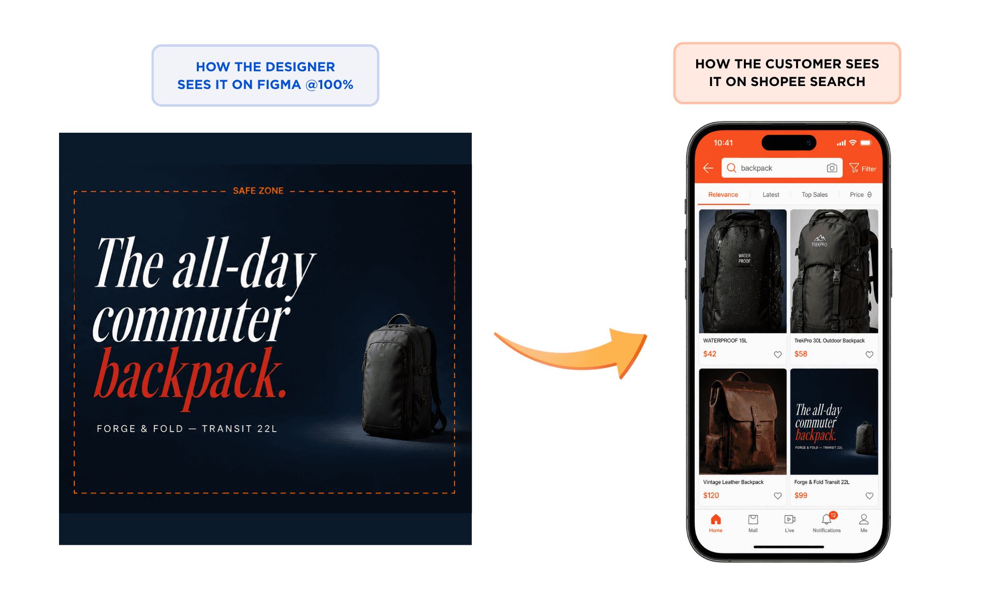
Verdict: In a search grid, your product competes against five others. If shoppers can't tell what you're selling in the thumbnail, you've already lost.
The fix: The product fills 60–80% of the square frame, dead center, on the very first slide. Editorial typography is great for slide 2 or 3. Slide 1 is identification: "this is a backpack, here's what it looks like, this is the brand." The shopper either taps in or scrolls past based on a 0.5-second glance at a postage-stamp thumbnail.
The Squint Test: Hold your design at arm's length and squint until the details blur. Can you still tell what the product is? If not, the composition is wrong.
Break #4 — Shopee Labels that Overlaps
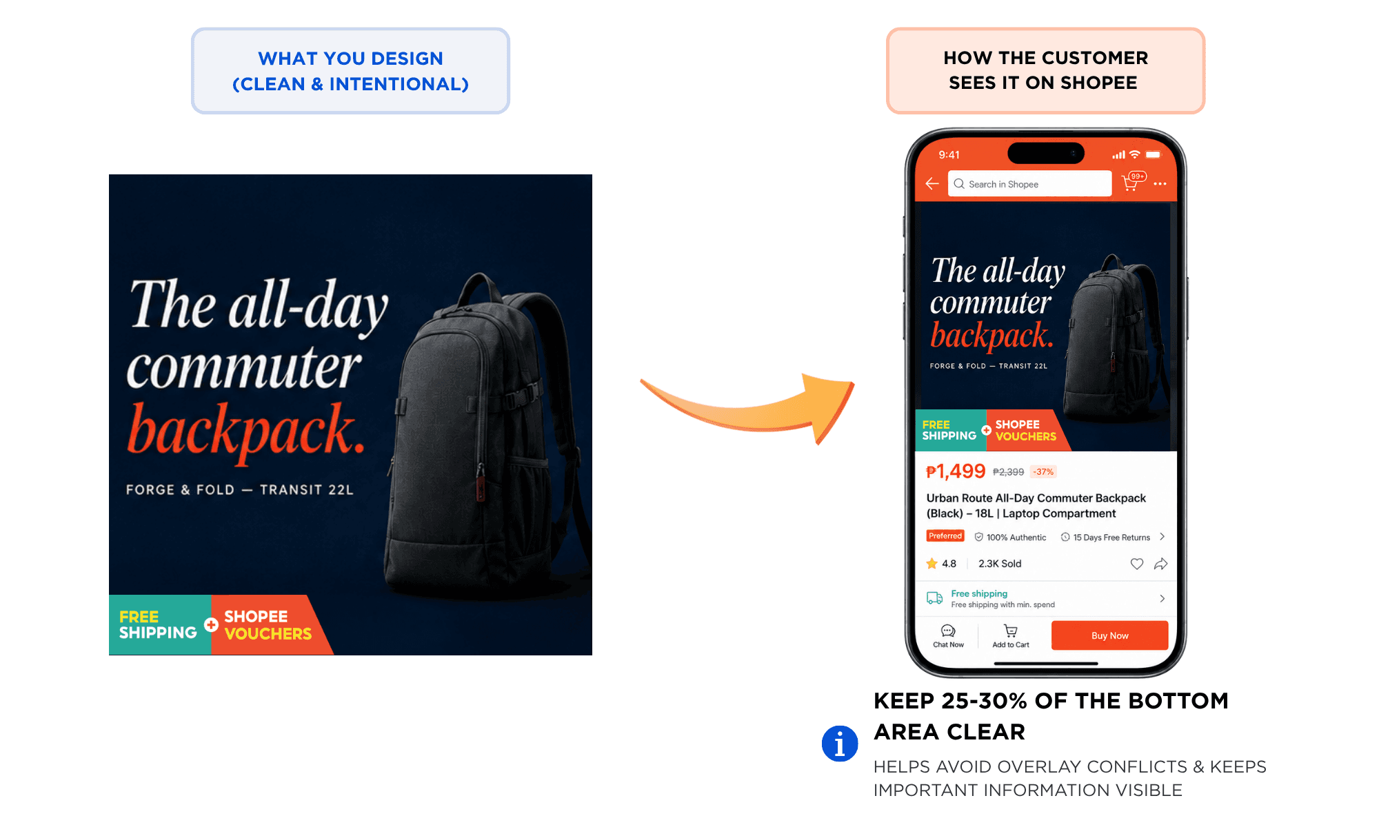
Verdict: Product is covered, trust badge covered and invisible, text or logo is cut off.
The fix: Leave at least 10% of space at the bottom.
02 — The Carousel Cliff: Where Your Shoppers Actually Stop Swiping
Beyond the image itself, there's a structural issue most sellers ignore: the carousel. You get nine slides on Shopee, eight on Lazada. Most brands treat them as equally weighted real estate. They aren't. Drop-off across slides is brutal, and predictable.
The implication: slides 1–3 are your entire pitch. Everything past slide 4 is bonus material for the small slice of high-intent shoppers who are already 80% of the way to buying. If your hero claim, key differentiator, and primary social proof aren't all visible by slide 3, most of your audience will never see them.
What Goes Where
Our default carousel architecture for clients, after auditing hundreds of listings:
Slide 1 — Identification + hook. What is it, who's it for, what's the headline benefit. Product fills the frame, square crop, 1.5-second-readable claim.
Slide 2 — The differentiator. The single thing that makes this product different from the four others above it in the search grid.
Slide 3 — Social proof. Reviews, ratings, before/after, "1M+ sold." The trust hit before the shopper makes the call.
Slide 4 — Use in context. Lifestyle shot, real human, real environment. The "this is what owning it looks like" frame.
Slide 5–6 — Specs & details. Sizes, dimensions, ingredients, how to use the product, warranty information... The reference info high-intent shoppers actually want.
Slide 7–9 — Bonus. Certifications, FAQs, bundle options, brand story. Material for the 4–9% who'll get this far.
Pull quote: "Slide 1 isn't a hero shot. It's a one-second decision. Treat it that way."
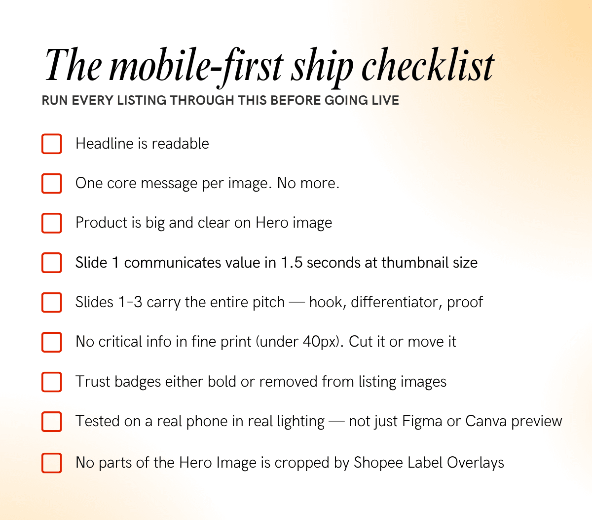
03 — The Mindset Shift: Six Principles for Designing Mobile-First

The Leap rule: no listing ships until it's been viewed on the actual Shopee / Lazada / TikTok App on mobile.
04 — The Brands That Win on Shopee, Lazada, and TikTok
It's not the ones with the prettiest desktop comps. It's not the ones with the biggest creative budgets. It's the ones who internalised this very truth: your customer is on a phone, on a train, with a thumb, and you’ve got less than 7 seconds to stir their interest. Design for that reality and the rest follows.
Everything in this article is a derivative of that one shift. The text sizes, the carousel architecture, the squint test—all of it is just operationalizing what mobile-first actually means when you're selling on platforms where 91% of your customers will never use anything else.
Most listings still aren't doing this. Which means—if you do—you're not just designing better. You're competing in a different arena.
© Leap 2026 — Brand & design for SEA eCommerce · Singapore · Malaysia
Want a second pair of eyes on your listings?
Leap audits Shopee and Lazada PDPs for SEA brands every day. We'll review your top listing, flag the mobile-first issues, and tell you what to fix first—free.